
Welcome to the third of this four-part series on colour therapy, introducing you to how to use the colours of the rainbow to balance and enhance your wellbeing. Take a look back at the previous blogs to recap the theory of colour therapy and learn how to create your own colour journal to discover how to make different colours work for you personally.
In the last part we discussed the “warm” colours – red, orange and yellow – and how we can use them to “warm us up” emotionally and make us feel more energised, brave, outgoing and determined. This time we turn our attention to the “cooler” blues and greens, and how they can calm or steady our emotions.
There are many different blues and greens and they don’t all have the same effects, so read on, do some research or just look around you to identify some of the different ones and record your response accordingly.
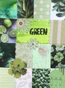
GREEN is, of course, the colour of the natural world, signifying balance and growth. When we’re around green we feel relaxed – this is partly why gardening or walks in nature are good for us. Fresh and youthful, it denotes vitality and new ways of doing things – it’s a good colour to wear when taking classes or learning something new. However, there are more variations of green than any other colour and the effects you may experience from these can vary significantly; take care when choosing greens for your surroundings. Pale “yellowy” greens are uplifting and refreshing, whereas olive or bottle green can feel stagnant and heavy; these are not easy colours to wear or have in your home.
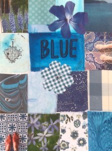
BLUE, research shows, is most people’s favourite colour – but like green, there are quite a few variations of it. Sky blue, for example, signifies order and tranquility but can also be mysterious and reflective – imagine a peaceful lake on a summer’s day. It calms our nervous system and keeps us cool-headed in stressful situations, and is often suggested as a good colour for bedroom decor due to its soothing qualities. Conversely, the brightness of turquoise awakens the mind so is not ideal for bedrooms. Darker blues, meanwhile, can feel chilly and aloof – think of navy and midnight blue which may be good staple colours for a wardrobe but benefit from the addition of other colours to temper their “coldness”.
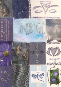
INDIGO is also a dark blue but softer than navy, with just a hint of warmth. It reflects knowledge, order and confidence, is another colour of tranquility and can calm the nerves. It works well with most other colours in a wardrobe.
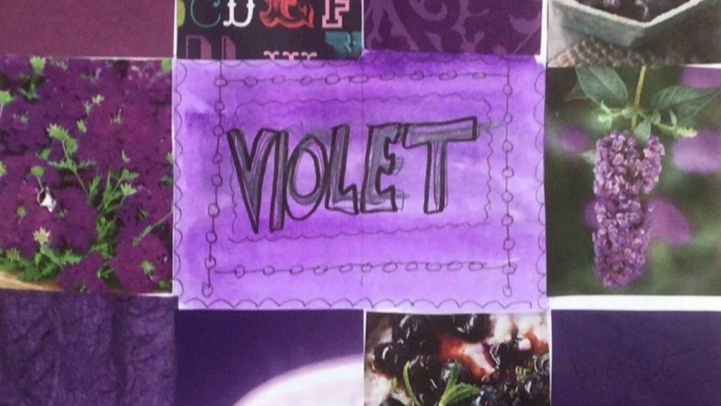
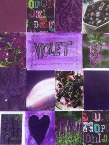
VIOLET is a rich, velvety, luxurious colour. It can feel very intense – imagine dark stormy skies. Neither red nor blue, it combines the power, energy and strength of red with the integrity and truth of blue. It signifies purpose and focus, integrity and dedication (it’s often seen as the colour of royalty) and generates feelings of self-respect. Wear it when you are going through a transition and you want to attract new opportunities. Again though, consider the variations – lilac, lavender, mauve, aubergine and purple may create very different responses in you. If you’re considering introducing purple into your home or clothing, avoid too much of it as it can be overwhelming; it may be best used as an “accent“ colour.
We’ve now covered the main colours that we see/experience – hopefully there’s been some food for thought for you! In the concluding part of the series, next time (in a fortnight) we’ll take a look at some neutral and “in between” colours, and end with a few more thoughts about the role of colour in our lives.
LIVE COLOUR THERAPY ZOOM SESSION
Once the final colour therapy blog is published, I would like to offer a live session on Zoom where we can discuss together our findings and exchange our thoughts and questions on this process. If this would be beneficial and appealing to you and you would like to take part, please email connie@maryfrancetrust.org.uk to let her know. If we have enough participants, we will set a date for this session and send you the details. If no-one feels the need to have one, no problem at all. Entirely up to you!
Don’t forget to share pictures of your colour mood boards or colour journals with us! If you’re happy for MFT to post them on social media to share your experience and inspire others to take part, email them to connie@maryfrancestrust.org.uk. MFT can publish them anonymously or use your first name, it’s entirely up to you!
Thank you!
Diana