Welcome to 2021! Let’s hope it will be a better one for us all than last year. January inevitably starts off cold and dreary, but let’s think positive and see what we can do to lift our spirits (not necessarily by eating any remaining Christmas chocolates!)
Introducing colour therapy… a way to help us understand our need for health and relaxation, enhancing our mood, behaviour and general wellbeing. It’s a surprisingly big, fascinating subject, but we’ll keep it basic: colour is simply light of varying wavelengths, thus each colour has its own wavelength and “energy” that we absorb in different ways and can use to our advantage. As a therapeutic tool it draws on many different traditions, dating from ancient times up to today’s popular science and psychology. Modern practitioners borrow from folk superstition, Eastern mysticism and Western psychological research, using a variety of ways to restore the delicate balance of energy and alleviate physical, emotional and mental conditions.
On a very down-to-earth level, there’s a simple way to incorporate colour therapy into our lives by becoming more conscious of colour and using it in a positive way. For example, wearing a plain black jumper won’t do much to cheer us up and may in fact make a low mood worse – swap it for a yellow or pink one and we may well feel a shift in our mood. Equally, pale blue or pink bedroom decor may feel restful and sleep-inducing; more so than a purple or orange colour scheme.
However, people vary in their perception of different colours and how they respond to them, so it’s all about finding out how they work for YOU. For instance, red can signify energy and excitement for some people, but anxiety or danger to others; blue can be calming for some but depressing for others. In this four-week blog, without getting too technical, we will look at the properties of different colours, identify how certain colours make us feel, and use that knowledge to help ourselves.
You can read each of these blogs as a series of articles, but to get the most from them, it would be great to keep your own notebook or journal to compile colour swatches and your responses to them. You may be surprised at what you come up with and you can use the results to refer back to when you need a mood shift.
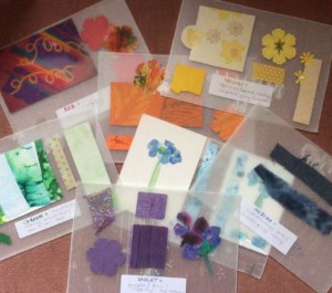
So let’s make a start. Find some pieces of plain paper, card or a notebook to use as your colour therapy journal and write the name of a colour at the top of each page – red, orange, yellow, green, blue, indigo, violet (colours of the rainbow) plus pink, grey and brown. Then find some old magazines, junk mail, greetings cards, scraps of fabric etc, cut out a few small pieces in each of the colours and stick a few pieces onto the corresponding page. You can cover most of the page or only a small part of it, whichever you like, but leave some space to write notes. You don’t have to do all this at once – over the four weeks of this blog might be manageable.

The idea is to create your own record of the main colours and how you feel about them. So for example if you’re feeling in a rut, you might look at your journal and see a note you made that orange makes you feel energised – so find a way to put something orange in your day. Maybe you have a scarf in orangey tones to wear, or you could paint a bowl of tangerines – or just get coloured pencils and cover a page in orange scribbles. Feeling stressed and overwhelmed? – look in your journal… if you noted that blue makes you feel calm, surround yourself with soft blues… you may have a pretty mug to drink from all day, or why not paint your nails blue? Doing this is not a magic solution to anything but it might just help tip the balance, and sometimes even the act of doing something positive creates an energy shift to improve your mood.
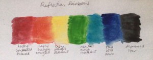
If you don’t want to make a colour journal – although I encourage you to do so, it’s fun as well as useful – here’s a quick way to test your emotional response to colours. This exercise is adapted from Fearne Cotton’s book “Happy” and it involves making a little “Reflection Rainbow” by painting or colouring a strip of different colours. Next to each colour, write two or three words as your response to each of them, eg:
Red = happy, contented
Orange = excitable, energised
Yellow = peaceful, observant
Green/blue = neutral, indifferent
Indigo = sad, cold
Black = depressed, low

You may not have these particular responses, they are just examples – but when you’ve added your own thoughts on each colour you can use the reflection rainbow as a way of seeing how you may be able to change your mood. For instance, if you look at your rainbow one morning and are feeling low, try not to wear black that day – pick a different colour. Usually the “warm” colours – red, orange, yellow – will lift your spirits.
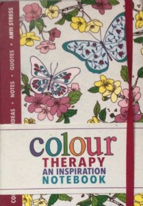
In the next three colour therapy blogs we’ll look at the properties of the different colours in more detail and how you can use them to improve your outlook. As I said at the top, colour therapy is a very big topic and we’ll only scratch the surface, but if it interests you, there are lots of info online and many books on the subject. If you just want to dip your toe in the water, this is a nice little book which you can pick up cheaply on eBay:

See you in two week’s time (the craft blogs will now be fortnightly!)
Don’t forget to share pictures of your colour journals with us! If you’re happy for MFT to share them on social media too to inspire others to take part, email them to Connie Ridout, Communications Lead at MFT, at connie@maryfrancestrust.org.uk
Thank you!
Diana

