The first blog in this four-part series provided an introduction to colour therapy – the science and general principles behind it. We considered how different colours can affect us and how we might be able to utilise colour in our everyday lives to redress any imbalance and enhance our general wellbeing.
Broadly speaking, the warm colours (red and orange) will warm up our emotions, while the cool ones (green and blue) will calm us down – although it’s up to you to decide on your personal response to them and use what you discover according to your need at any point. This week we’ll look specifically at the warm colours; in part three we’ll turn to the cool ones, and in the final part we’ll consider more neutral colours and draw some general conclusions.
If you’ve started a colour therapy journal as suggested previously, you may already have some colour swatches to refer to, but you can start at any time. Look through old magazines etc and cut out small pieces in each of the colours – red, orange, yellow, green, blue, indigo, violet – and stick them onto separate pages for each colour. You could also use scraps of fabric or ribbon, or use coloured pencils or paints to create swatches. Then add a few words to each page to describe how those colours make you feel. The idea is that you compile your own record of the different colours and your response to them, so you can use what you’ve produced as a guide to subtly altering your emotions.
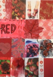
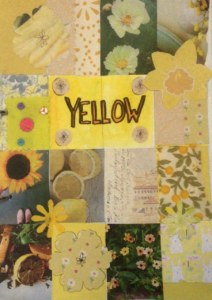
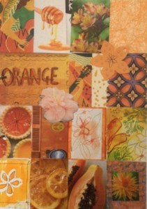
You don’t have to keep a journal – just look around you and train yourself to become more aware of the role of colour in your life. Your choice of clothing is one obvious way to incorporate more of a particular colour and consequent mood shift into your life, but look also at your immediate surroundings, your decor, even your food choices… having a bowl of tomatoes or oranges in the kitchen to look at may make you feel more cheerful than a bunch of black grapes! Here’s a little more detail on red, orange and yellow with some colour collages to give you the idea and test your responses:
Let’s look first at RED. It’s perceived as an intense, passionate colour, energising and bold – but also signifying heat, danger and aggression. How do you feel about red? Does it get you moving, make you feel warm, brave and more outgoing? – if you want to get going, try to incorporate more red into your life. However, red can also attract attention to ourselves so it’s a colour to avoid if you’re feeling nervous or self-conscious; in that case look to other colours to invite more calming energy into your life. Similarly, if you find it difficult to relax, look around you – is there a lot of bright red? – you may need to tone it down.

YELLOW is stimulating and uplifting… it’s the joy we feel when we see a burst of sunlight, a field of daffodils or a zesty lemon. It’s associated with optimism and enthusiasm, and it can boost self-esteem. It makes us open to new ideas, lifts our spirits and generates happiness, confidence and positivity. However, too much yellow can make us feel irritable, anxious or nervous, and it can drain energy levels, so avoid wearing it if you feel tired. There are many different tones of yellow, from cool lemon to deep mustard – if you like yellow and are thinking of redecorating or buying a new outfit, spend some time considering all the different ones and the effect they have on you.

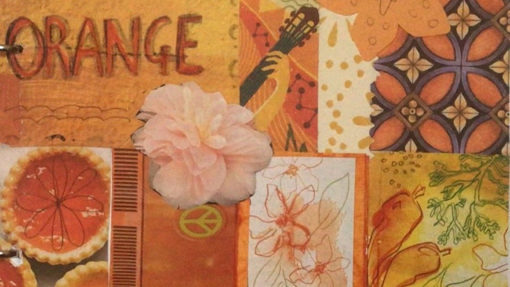
ORANGE is made up of red and yellow and combines the qualities of both. It radiates warmth and happiness… it can suggest the comfort of a sizzling fireplace or the beauty of a summer sunset. It’s also sensual, provocative and fun. If we wear something orange we may feel more confident and sociable, energetic and youthful. Wearing this colour can motivate you, lift your spirits, and stimulate your creativity. It’s a good, less dramatic alternative to red if you want to feel more positive but you find red is too intense. Be careful though – too much orange can appear frivolous and unrefined, so if you like orange as a colour, you may want to avoid the very bright tones and opt for a gentler peach/apricot.

This wasn’t intended to be a “craft” blog in the same way as the projects I suggested last year, but if you want to do something arty, colour therapy is a good subject. Why not produce a collage page for each colour – either in a similar way to what I’ve done here, or in your own style – that you can add to your journal? Doing so will really add to your awareness of how colour and how it works for you.
Next time (in a fortnight) – greens and blues!
Don’t forget to share pictures of your colour mood board or journal with us! If you’re happy for MFT to post them on social media to share your experience and inspire others to take part, email them to Connie Ridout, Communications Lead at MFT, at connie@maryfrancestrust.org.uk. MFT can publish them anonymously or use your first name, it’s entirely up to you!
Thank you!
Diana

