This is the final part of our four-week series looking at colour therapy – a simple version of the science behind how different colours have different energies and how we can use them in our everyday environment to enhance our wellbeing. We’ve considered how introducing the “warm” colours – red, orange and yellow – into our home or clothing can invigorate and motivate us, and how the “cooler” tones of greens and blues can make us feel calm.
But there are other, “neutral” colours besides the colours of the rainbow, so to conclude the discussion, let’s look at some of these and their positive and negative connotations.
BLACK – glamorous, elegant and sophisticated, black also screams authority and gravitas. It’s a popular staple colour in our wardrobes, partly because it offers emotional safety by creating a protective barrier, almost a shield that we can hide behind. However, too much of it can cause feelings of heaviness and oppression so it’s best to avoid dressing head-to-toe in black if you’re experiencing a difficult time. To the people around us, it can appear menacing, scary, cold and overly serious – if that’s not an impression you want to create, cheer things up with the addition of bright colours.
BROWN is the colour of the earth and trees – we feel “grounded”, reassured and safe around it; it represents security, solidarity and permanence. It feels warm, cosy, safe and reliable. Like black, brown is a “serious” colour, but softer, and conveys a sense of reliability so is a good colour to wear if you want to be taken seriously – useful for job interviews perhaps. Too much of it though can feel dull and boring, humourless and unsophisticated; it’s not the most joyful of colours. If you like brown and want to incorporate it into your environment, warmer golden tones create a more inviting feel than the cooler ash browns.
GREY is a mature, practical colour. It draws no attention to itself and recedes, allowing brighter colours around it to take precedence. It’s a colour to wear if you want to be left alone – it’s easy to hide behind. In the home, it cocoons you from the world, creating a feeling of hibernation, but what may at first feel calming can over time become draining and tiring, so avoid too much of it. Like other colours, there are different tones of grey, warm and cool; the softer warmer ones are easier to wear or be around than the very dark, gunmetal ones… imagine dark skies full of rain, creating a gloomy mood – probably not what you want.
WHITE symbolises peace and quiet, simplicity and clarity. Wearing or surrounding ourselves with white can clear a cluttered mind and is often used in the home as a “blank canvas” for other colours. In clothing, it’s a colour mainly worn in summer but we need to be well and glowing as it can drain us, so best with a suntan! Again, look at tones of white – warm ivory and pale cream are more forgiving to wear or be around than pure brilliant whites. In public places, white can feel cold and uncaring, isolating and remote. It’s perceived as hygienic, clean and orderly, but in the same context can cause feelings of fear and isolation; some hospitals and care environments are moving away from all-white for this reason.
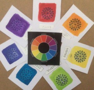
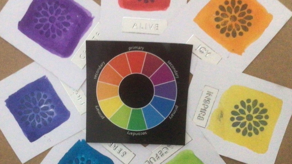
So what do we conclude from these four short articles about colour therapy? I’d say really, that once we realise how different colours can affect us, we have an unexpected and fascinating source of power to tap into if we want or need to change how we feel. Colour therapy is not a magic wand, but like all complementary therapies, it may have a role to play in helping ourselves easily and harmlessly. Why not try it – you have nothing to lose and maybe quite a lot to gain. If you haven’t already, maybe start a colour journal (as described in part one) at this point and see if that helps to focus your responses to the different colours. Or you could make a set of cards with colour swatches and one or two words describing what they mean for you.
The bottom line, though, is this – choose whatever colours make you happy. We’ve looked only briefly at different colours and perhaps become more aware of how they might affect us, but only you know what works for you. If you like sky blue pink with orange and purple stripes in your home or wardrobe – go for it! In colour therapy, there may be certain principles but there are no hard and fast rules. So create your own rainbow – and lead a colourful life!

COLOUR THERAPY LIVE CHAT
To complement her blog series, Diana invites us for a Colour Therapy Live Chat on Thursday 4 March, 2pm-3pm on Zoom to discuss the topic in more depth, answer any questions you may have, share our findings and colour journals to deepen our understanding of colours.
If you’d like to join this session, please contact Ruby at ruby@maryfrancestrust.org.uk by Wednesday 3 March so she can send you the Zoom link. We will need a minimum of 6 participants to run the session so please don’t hesitate to book your place!

